Part 4: New screens
With the initial repository cleanup complete, we’re ready to build the screens for our app.
Our application will feature three primary screens, with the Settings screen also containing two modals:
- PlaylistScreen: The main screen to display a list of songs
- PlayerScreen: A screen to display the currently playing song
- SettingsScreen: A screen with options to customize the app
- SettingsThemeScreen: A modal for changing the app’s theme
- SettingsAccentScreen: A modal for changing the app’s accent color
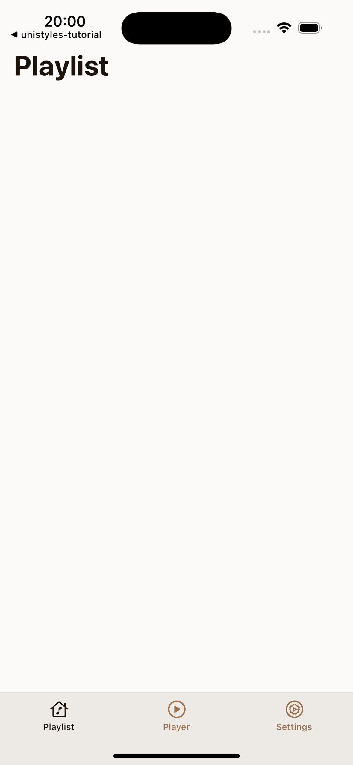
PlaylistScreen
First, let’s repurpose the existing app/(tabs)/index.tsx file to become our PlaylistScreen.
This involves changing the component name from HomeScreen to PlaylistScreen and wrapping the content in a ScrollView:
 import { ScrollView } from 'react-native';import { ThemedText } from '@/components/ThemedText'import { ThemedView } from '@/components/ThemedView'import { StyleSheet } from 'react-native-unistyles'
 export default function PlaylistScreen() { export default function HomeScreen() {  return (      <ScrollView contentContainerStyle={styles.container}>      <ThemedView style={styles.container}>        <ThemedText type="title">          Home Screen        </ThemedText>      </ThemedView>      </ScrollView>  );}
const styles = StyleSheet.create(theme => ({  container: {    flex: 1,    alignItems: 'center',    justifyContent: 'center',  }}));
Next, let’s update the title and adjust the container styles. We’ll remove the centering styles for now, as we want our content to start from the top.
import { ThemedText } from '@/components/ThemedText'import { ScrollView } from 'react-native'import { StyleSheet } from 'react-native-unistyles'
export default function PlaylistScreen() {  return (      <ScrollView contentContainerStyle={styles.container}>        <ThemedText type="title">          Home Screen          Playlist        </ThemedText>      </ScrollView>  );}
const styles = StyleSheet.create(theme => ({  container: {    flex: 1,    alignItems: 'center',    justifyContent: 'center',  },}));
Oops! We have a problem. Our title has no padding, and the phone’s notch is overlapping it.
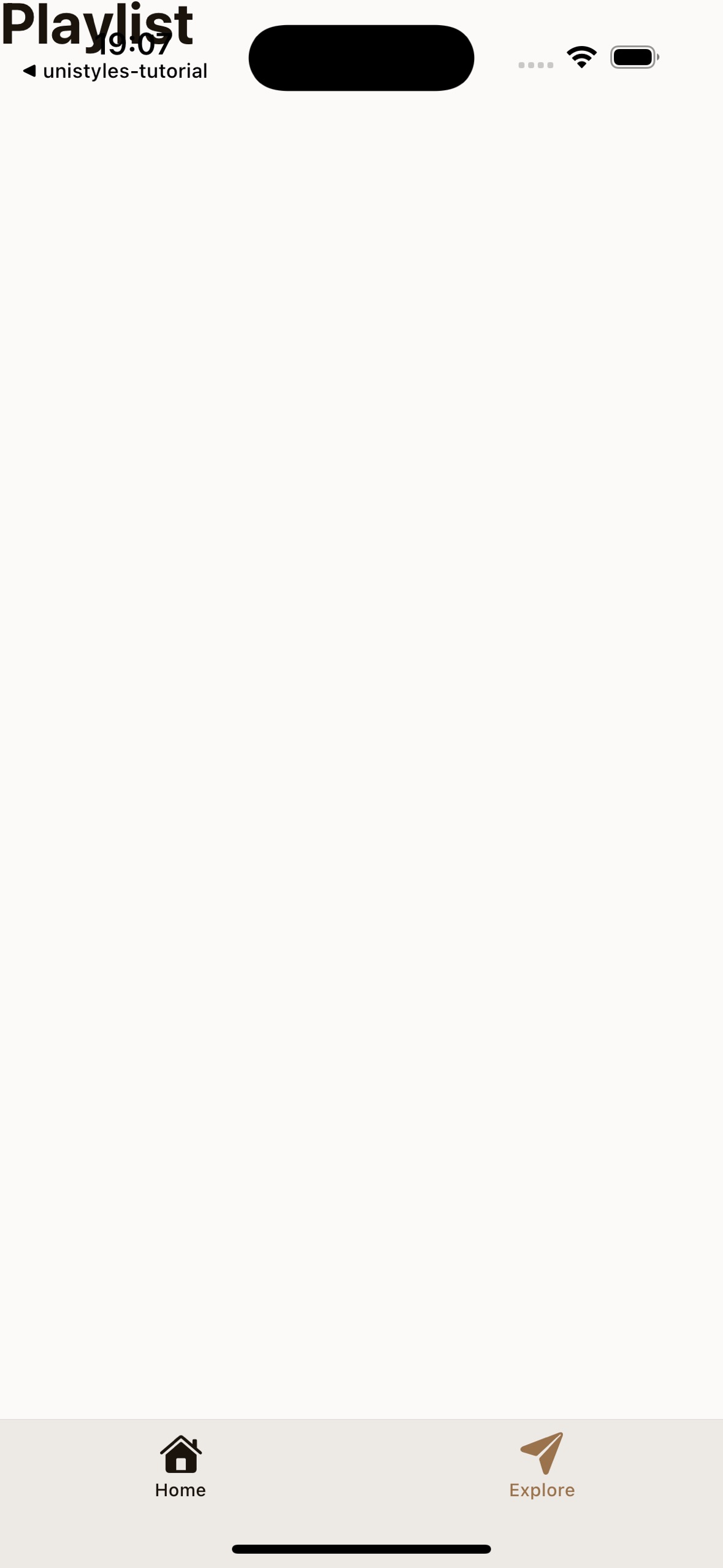
Unistyles to the rescue! We don’t need to rely on any other package or hook to handle this.
Remember the rt object from StyleSheet.create? It contains useful device metadata, including rt.insets.
Safe area insets define the portion of the view that is unobscured by system elements like notches or the home indicator. With Unistyles, you have direct access to these values:
- top
- bottom
- left
- right
- ime (an animated inset that changes when the keyboard is shown)
Let’s use rt.insets.top to add a top margin to our container, pushing the content below the notch:
const styles = StyleSheet.create((theme, rt) => ({ const styles = StyleSheet.create(theme => ({ container: { flex: 1, marginTop: rt.insets.top, },}));To give our content some breathing room, let’s also add horizontal padding using our theme’s spacing system:
const styles = StyleSheet.create((theme, rt) => ({ container: { flex: 1, marginTop: rt.insets.top, paddingHorizontal: theme.gap(2), },}));PlayerScreen
For the PlayerScreen, we’ll start by creating a new file structure and then use a modified version of our PlaylistScreen code.
Expo Router uses a file-based routing system. To create a dynamic route for our player, create the following folder and file:
Directoryapp/
Directory(tabs)/
Directoryplayer/
- [songId].tsx
- _layout.tsx
- index.tsx
- _layout.tsx
- +not-found.tsx
Now, populate app/(tabs)/player/[songId].tsx with the following code. It’s very similar to PlaylistScreen, but with the title changed to “Player”.
import { ThemedText } from '@/components/ThemedText'import { ScrollView } from 'react-native'import { StyleSheet } from 'react-native-unistyles'
export default function PlayerScreen() {    return (        <ScrollView contentContainerStyle={styles.container}>            <ThemedText type="title">                Player            </ThemedText>        </ScrollView>    );}
const styles = StyleSheet.create((theme, rt) => ({ container: { flex: 1, marginTop: rt.insets.top, paddingHorizontal: theme.gap(2) },}));SettingsScreen
The SettingsScreen is our final main screen. It will serve as a hub for navigating to the modal screens where users can change the app’s theme and accent color.
First, set up the required files and folders:
Directoryapp/
Directorysettings/
- _layout.tsx
- index.tsx
- settings-theme.tsx
- settings-accent.tsx
Directory(tabs)/
Directoryplayer/
- [songId].tsx
- _layout.tsx
- index.tsx
- _layout.tsx
- +not-found.tsx
This is a standard Expo Router stack layout. Let’s add the code for each of these new files.
1. Configure the Stack Navigator (_layout.tsx)
This file configures the stack navigator for the settings section, defining the main screen and the two modal screens.
import { Stack } from 'expo-router'import React from 'react'import { useUnistyles } from 'react-native-unistyles'
export default function SettingsLayout() {    const { theme } = useUnistyles()
    return (        <Stack            screenOptions={{                contentStyle: {                    backgroundColor: theme.colors.background                }            }}        >            <Stack.Screen                name="index"                options={{                    title: 'Settings',                    headerShown: false                }}            />            <Stack.Screen                name="settings-theme"                options={{                    title: 'Change theme',                    presentation: 'modal',                    headerShown: true                }}            />            <Stack.Screen                name="settings-accent"                options={{                    title: 'Change accent',                    presentation: 'modal',                    headerShown: true                }}            />        </Stack>    )}
2. Create the Main Settings Screen (index.tsx)
This is the main SettingsScreen. The code is almost identical to our other screens for now.
import { ThemedText } from '@/components/ThemedText'import { ScrollView } from 'react-native'import { StyleSheet } from 'react-native-unistyles'
export default function SettingsScreen() {    return (        <ScrollView contentContainerStyle={styles.container}>            <ThemedText type="title">                Settings            </ThemedText>        </ScrollView>    );}
const styles = StyleSheet.create((theme, rt) => ({    container: {        flex: 1,        marginTop: rt.insets.top,        paddingHorizontal: theme.gap(2)    },}));
3. Create the Modal Screens
The modal screens for changing the theme and accent color are also simple placeholders. Notice the component names and titles are updated for each.
import { ThemedText } from '@/components/ThemedText'import { ScrollView } from 'react-native'import { StyleSheet } from 'react-native-unistyles'
export default function SettingsThemeScreen() {    return (        <ScrollView contentContainerStyle={styles.container}>            <ThemedText type="title">                Change theme            </ThemedText>        </ScrollView>    );}
const styles = StyleSheet.create((theme, rt) => ({ container: { flex: 1, marginTop: rt.insets.top, paddingHorizontal: theme.gap(2) },}));import { ThemedText } from '@/components/ThemedText'import { ScrollView } from 'react-native'import { StyleSheet } from 'react-native-unistyles'
export default function SettingsAccentScreen() { return ( <ScrollView contentContainerStyle={styles.container}> <ThemedText type="title"> Change accent </ThemedText> </ScrollView> );}
const styles = StyleSheet.create((theme, rt) => ({ container: { flex: 1, marginTop: rt.insets.top, paddingHorizontal: theme.gap(2) },}));You should now be able to navigate to all three screens, each with a different title but the same basic layout.
TabBar
Currently, TabBar doesn’t reflect our new screen structure. Let’s update app/(tabs)/_layout.tsx to correctly register our routes and assign new icons.
import { IconSymbol } from '@/components/ui/IconSymbol'import { Tabs } from 'expo-router'import React from 'react'import { useUnistyles } from 'react-native-unistyles'
export default function TabLayout() {  const { theme } = useUnistyles()
  return (    <Tabs      screenOptions={{        tabBarInactiveTintColor: theme.colors.tint,        tabBarActiveTintColor: theme.colors.activeTint,        sceneStyle: {          backgroundColor: theme.colors.background        },        tabBarStyle: {          backgroundColor: theme.colors.foreground        },        headerShown: false      }}>      <Tabs.Screen        name="index"        options={{          title: 'Home',          title: 'Playlist',          tabBarIcon: ({ color }) => <IconSymbol size={28} name="house.fill" color={color} />,          tabBarIcon: ({ color }) => <IconSymbol size={24} name="music.house" color={color} />,        }}      />      <Tabs.Screen        name="player/[songId]"        options={{          title: 'Player',          tabBarIcon: ({ color }) => <IconSymbol size={24} name="play.circle" color={color} />,        }}      />      <Tabs.Screen        name="explore"        name="settings"        options={{          title: 'Explore',          title: 'Settings',          tabBarIcon: ({ color }) => <IconSymbol size={28} name="paperplane.fill" color={color} />,          tabBarIcon: ({ color }) => <IconSymbol size={24} name="gear.circle" color={color} />,        }}      />    </Tabs>  );}
Congratulations! You’ve successfully set up the basic screen structure and navigation for the app. The boilerplate is out of the way, and we’re ready to start bringing the designs to life in the next part!