
Part 8: Cross-platform
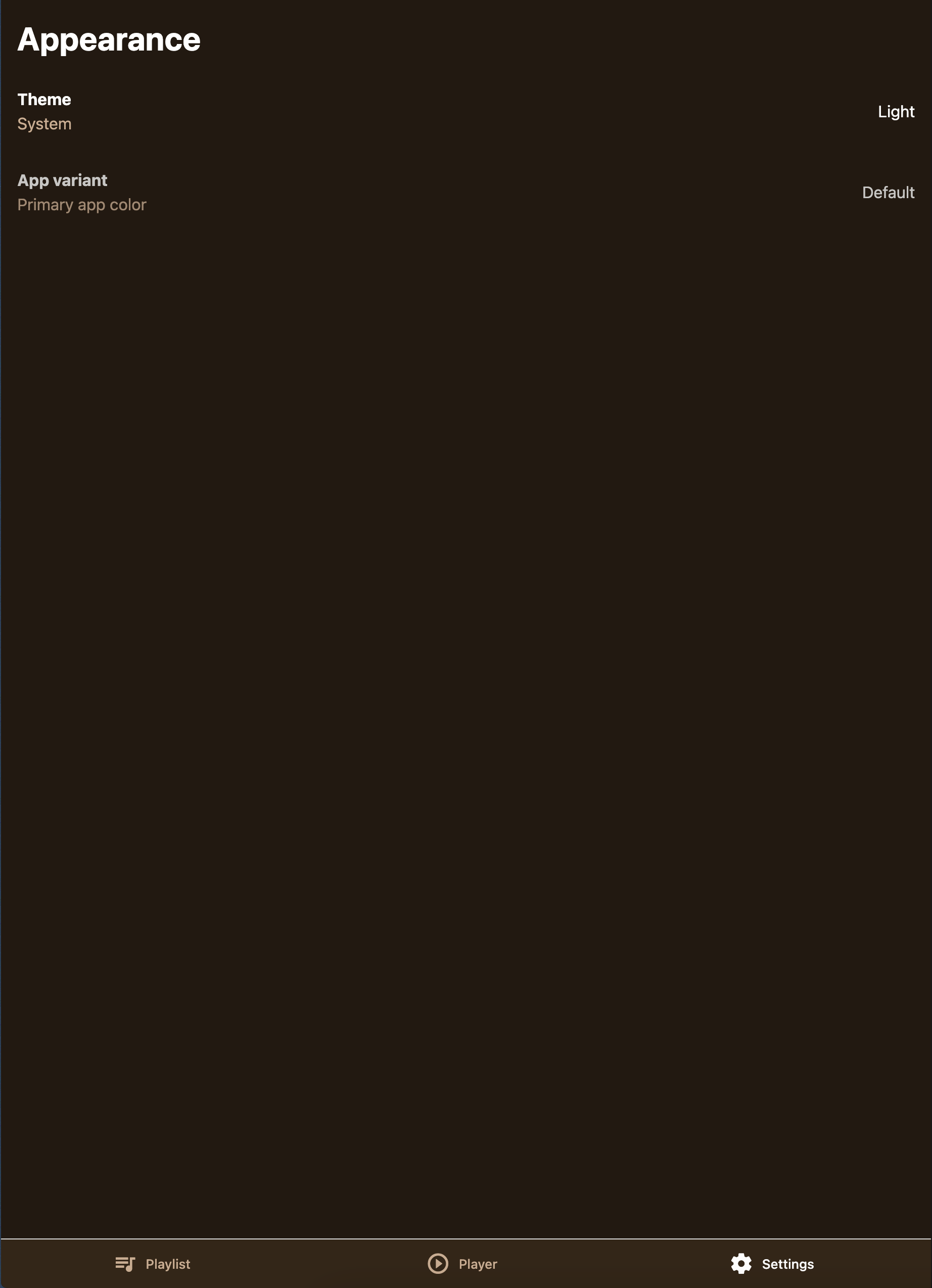
We’re in the final stretch! Our music app is looking great, but there’s one important piece missing. While users can browse songs, navigate between screens, and change theme settings, the accent color selection doesn’t actually work yet. The Button and PlayerControls components still use hardcoded “banana” colors.
In this final part, we’ll connect all the pieces together using a lightweight state management solution, making our app truly dynamic and personalized. We’ll also ensure our app works beautifully across iOS, Android, and Web platforms.
Adding State Management with StanJS
For managing the user’s accent preference across our app, we need a state management solution that’s both lightweight and efficient. After considering various options, we decided to use our in-house library called StanJS.
StanJS automatically generates setters for your state values and provides excellent TypeScript support. With just a few lines of code, we can add persistent state management that feels native to our Unistyles-powered app.
Installation and Setup
Let’s install StanJS along with MMKV for data persistence:
yarn add stan-js react-native-mmkvand then regenerate native folders:
yarn expo prebuild --cleanStanJS has built-in MMKV support that makes data persistence effortless.
Create the Store
First, let’s set up our store to manage the user’s preferred accent color:
import { Accents } from '@/unistyles'import { createStore } from 'stan-js'import { storage } from 'stan-js/storage'
export const { useStore } = createStore({    preferredAccent: storage<Accents>('banana'),})
The beauty of StanJS lies in its simplicity. To persist data, we just wrap our value in the storage helper, which uses MMKV underneath to save the accent preference. StanJS automatically creates a setPreferredAccent setter for us - no boilerplate required.
Before we can use our store, we need to create the Accents type. Let’s add it to our Unistyles configuration:
// ... existing imports and theme definitions
 export type Accents = keyof typeof lightTheme['colors']['accents']
type AppBreakpoints = typeof breakpointstype AppThemes = typeof appThemes
declare module 'react-native-unistyles' {    export interface UnistylesThemes extends AppThemes {}    export interface UnistylesBreakpoints extends AppBreakpoints {}}
// ... rest of configuration
This type gives us powerful type safety - TypeScript will know exactly which accent colors are available and prevent us from using invalid accent names.
Now let’s create a barrel export for our store:
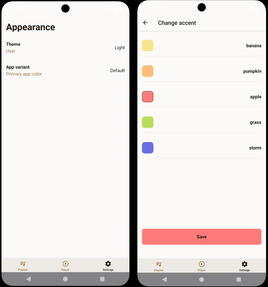
export * from './store'Connecting the Accent Settings
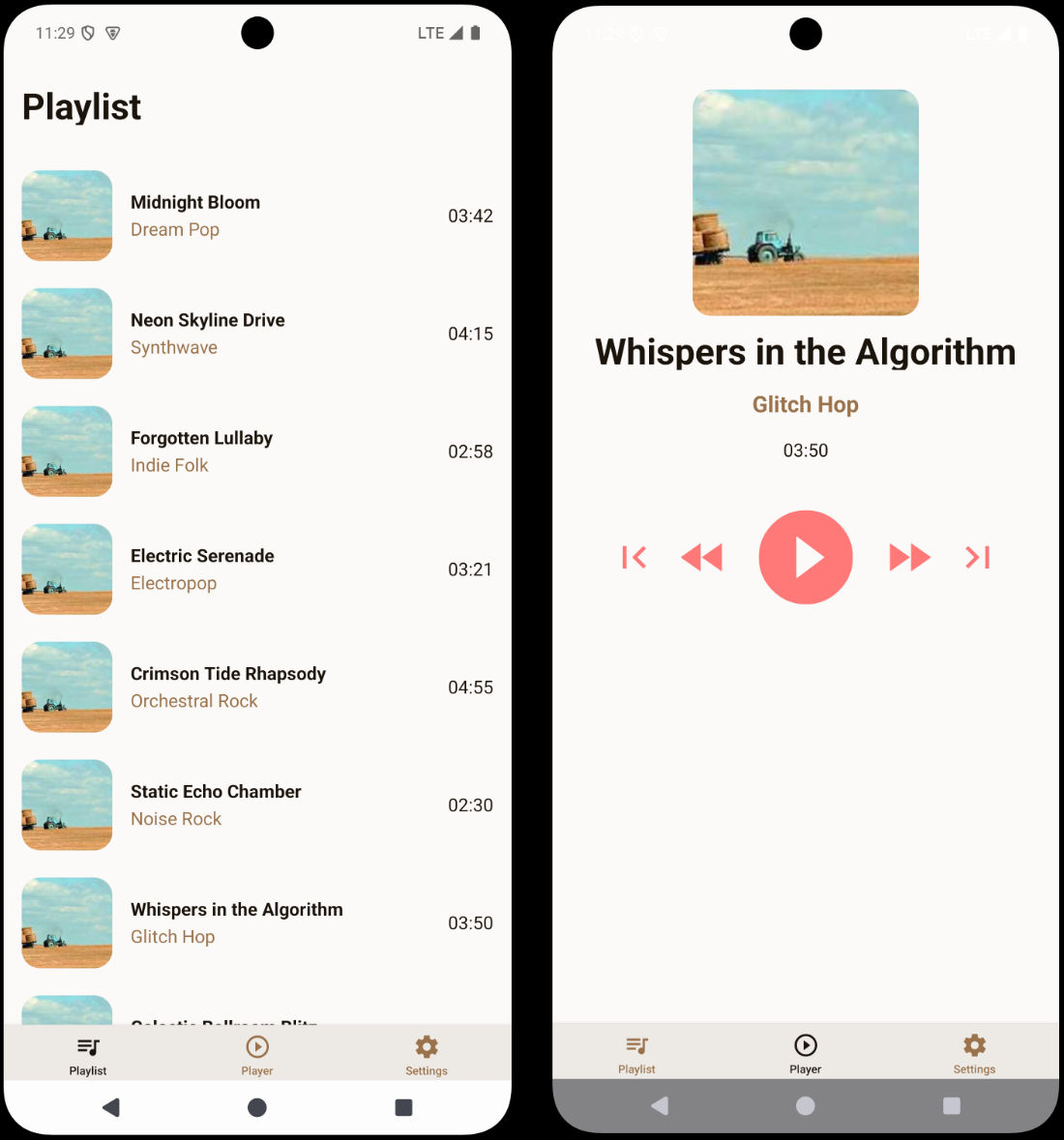
Now we need to update our accent settings screen to actually save the user’s choice to our store. Currently, it only updates local state that gets lost when the user navigates away.
Let’s update the settings screen to use our StanJS store:
import { Button } from '@/components/Button'import { ThemedText } from '@/components/ThemedText' import { useStore } from '@/store'import { router } from 'expo-router'import React, { useState } from 'react'import { Pressable, ScrollView, View } from 'react-native'import { StyleSheet, useUnistyles } from 'react-native-unistyles'
export default function SettingsAccentScreen() {    const { theme } = useUnistyles()    const { setPreferredAccent, preferredAccent } = useStore()    const allAccents = theme.colors.accents    const [selectedAccent, setSelectedAccent] = useState(preferredAccent)    const [selectedAccent, setSelectedAccent] = useState('banana')
    return (        <View style={styles.container}>            <ScrollView contentContainerStyle={styles.scrollView}>                <View style={styles.row}>                    {Object.entries(allAccents).map(([accentName, accentColor]) => (                        <Pressable                            key={accentName}                            style={styles.item}                            onPress={() => {                                setSelectedAccent(accentName as keyof typeof allAccents)                            }}                        >                            <View                                style={styles.box(accentColor, accentName === selectedAccent)}                            />                            <ThemedText bold>                                {accentName}                            </ThemedText>                        </Pressable>                    ))}                </View>            </ScrollView>            <View style={styles.buttonContainer}>                <Button                    label="Save"                    accent={selectedAccent}                    onPress={() => {                        setPreferredAccent(selectedAccent)                        router.back()                    }}                />            </View>        </View>    )}
// ... styles remain the same
Now we’re importing useStore from StanJS and accessing both the preferredAccent value and the auto-generated setPreferredAccent setter. We initialize our local state with the persisted value, and when the user saves their selection, we update the global store before navigating back.
The beautiful thing about this approach is that any other component that listens for the preferredAccent value will automatically re-render when the accent preference changes.
Making Components Dynamic
Now let’s update our components to respond to the user’s accent preference instead of using hardcoded values.
Update Button Component
The Button component needs to use the store value as a fallback while still allowing accent overrides:
import { Pressable } from 'react-native'import Animated, { useAnimatedStyle, withTiming } from 'react-native-reanimated'import { StyleSheet, UnistylesVariants } from 'react-native-unistyles'import { useAnimatedVariantColor } from 'react-native-unistyles/reanimated'import { ThemedText } from './ThemedText' import { useStore } from '@/store'
interface ButtonProps extends UnistylesVariants<typeof style> {    label: string,    onPress(): void}
export const Button: React.FunctionComponent<ButtonProps> = ({    label,    accent,    onPress}) => {    const { preferredAccent } = useStore()
    style.useVariants({        accent: accent ?? preferredAccent        accent: accent    })
    const color = useAnimatedVariantColor(style.buttonColor, 'backgroundColor')    const animatedStyle = useAnimatedStyle(() => ({        backgroundColor: withTiming(color.value, {            duration: 500        })    }))
    return (        <Pressable onPress={onPress}>            <Animated.View style={[animatedStyle, style.button]}>                <ThemedText bold>                    {label}                </ThemedText>            </Animated.View>        </Pressable>    )}
// ... styles remain the same
This implementation is flexible - it uses the accent prop if provided (like in the settings preview), but falls back to the user’s preferred accent from the store. This means the “Pick a song” button on the player screen will now use the user’s chosen accent color.
Update PlayerControls Component
The PlayerControls component should always use the user’s preferred accent:
import { IconSymbol } from '@/components/ui/IconSymbol' import { useStore } from '@/store'import { Pressable, View } from 'react-native'import { StyleSheet } from 'react-native-unistyles'import { useUnistyles } from 'react-native-unistyles'
export const PlayerControls = () => {    const { preferredAccent } = useStore()    const { theme } = useUnistyles()    const accent = theme.colors.accents[preferredAccent]    const accent = theme.colors.accents['banana']
    return (        <View style={styles.actions}>            <Pressable>                <IconSymbol name="backward.end.fill" size={40} color={accent}/>            </Pressable>            <Pressable>                <IconSymbol name="backward.fill" size={50} color={accent}/>            </Pressable>            <Pressable>                <IconSymbol name="play.circle.fill" size={100} color={accent}/>            </Pressable>            <Pressable>                <IconSymbol name="forward.fill" size={50} color={accent}/>            </Pressable>            <Pressable>                <IconSymbol name="forward.end.fill" size={40} color={accent}/>            </Pressable>        </View>    )}
// ... styles remain the same
Now the player controls will dynamically change color based on the user’s accent preference. The StanJS subscription ensures that the component re-renders only when the preferredAccent value changes.
We need to remove one more banana from [songId].tsx screen when there is no selected song:
import { Button } from '@/components/Button'import { PlayerControls } from '@/components/PlayerControls'import { ThemedText } from '@/components/ThemedText'import { ThemedView } from '@/components/ThemedView'import { playlist } from '@/mocks'import { router, useLocalSearchParams } from 'expo-router'import { Image, ScrollView } from 'react-native'import { StyleSheet } from 'react-native-unistyles'
export default function PlayerScreen() {  const { songId } = useLocalSearchParams()
  const song = playlist.find(song => song.id === Number(songId))
  if (!songId || !song) {    return (      <ThemedView style={[styles.centerContainer, styles.container]}>        <ThemedText type="title">          Looking for inspiration?        </ThemedText>        <ThemedText>          Pick a song from the playlist        </ThemedText>        <Button          label="Pick a song"          accent="banana"          onPress={() => router.replace('/')}        />      </ThemedView>    )  }
// ... rest of the file remains the same
Android
Now let’s test our app on Android to see if there are any platform-specific issues that need addressing.
Running the app on Android, you’ll notice it works correctly overall, but there’s one issue - the TabBar icons are missing! This happens because our IconSymbol component uses iOS-specific SF Symbols that don’t exist on Android.
Let’s fix the icon mappings in our IconSymbol component:
// ... existing imports and code
const MAPPING = {  'house.fill': 'home',  'paperplane.fill': 'send',  'chevron.left.forwardslash.chevron.right': 'code',  'chevron.right': 'chevron-right',  'music.house': 'queue-music',  'play.circle': 'play-circle-outline',  'gear.circle': 'settings',  'backward.end.fill': 'first-page',  'backward.fill': 'fast-rewind',  'forward.fill': 'fast-forward',  'forward.end.fill': 'last-page',  'play.circle.fill': 'play-circle-filled'} as IconMapping;
// ... rest of the component
These updated mappings use Material Design icons that are available on Android, ensuring our TabBar and player controls display properly across both platforms.
The previous mappings were defaults from the Expo starter template that didn’t match our actual icon usage. With these corrections, your Android app will have proper navigation icons and media controls.
We could also improve the bottom navigation bar by properly configuring react-native-edge-to-edge for Android’s gesture navigation, but that’s beyond the scope of this tutorial.
Web
When you try to run your app on the web, you will encounter a crash:
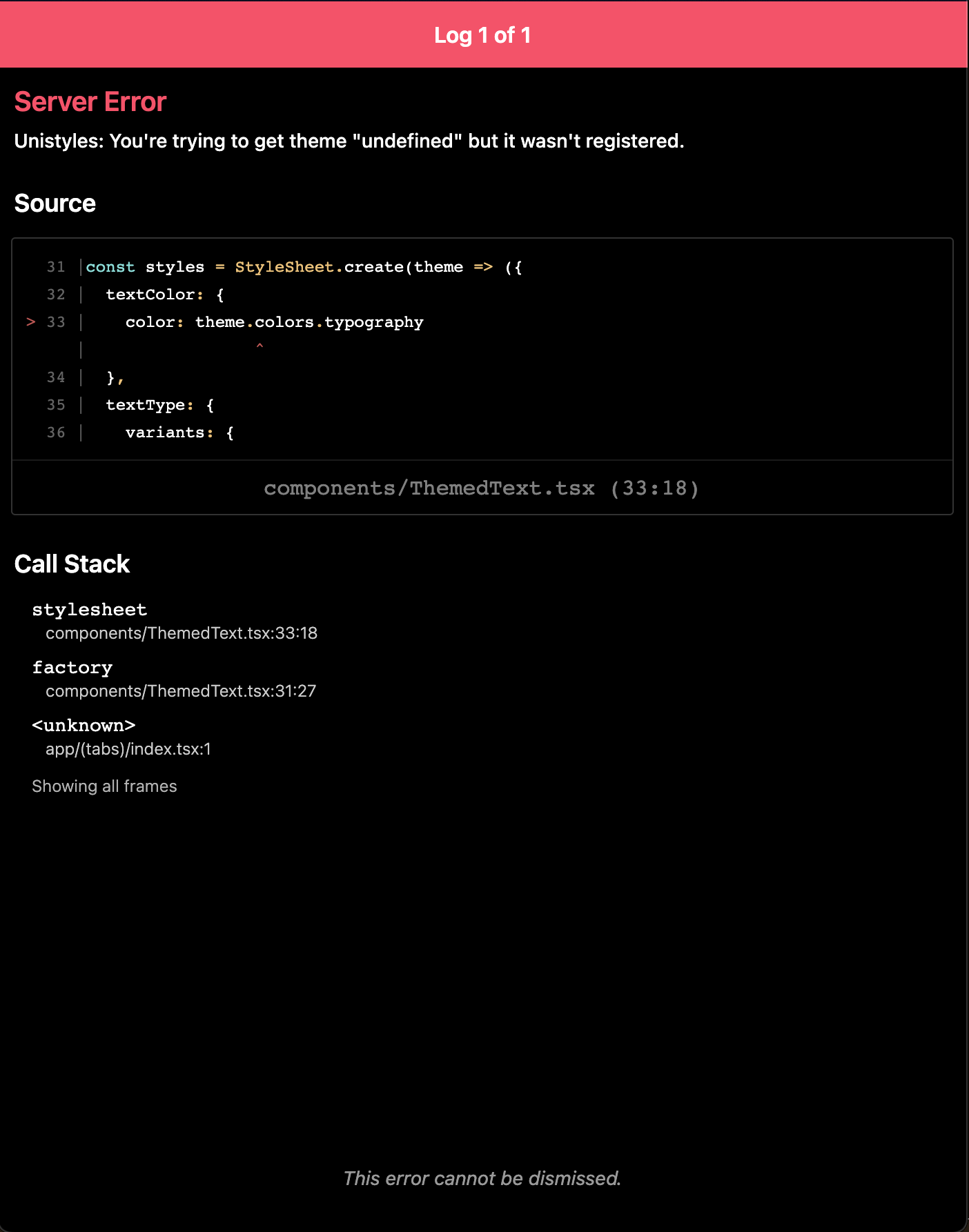
This happens because Expo Router uses static rendering by default, and Unistyles needs to be properly initialized for each page during the static rendering process.
To fix this, we need to create a custom HTML root file that ensures Unistyles is initialized correctly:
import { ScrollViewStyleReset } from 'expo-router/html'import { type PropsWithChildren } from 'react'import '../unistyles'
// This file is web-only and used to configure the root HTML for every// web page during static rendering.// The contents of this function only run in Node.js environments and// do not have access to the DOM or browser APIs.export default function Root({ children }: PropsWithChildren) {  return (    <html lang="en">      <head>        <meta charSet="utf-8" />        <meta httpEquiv="X-UA-Compatible" content="IE=edge" />        <meta name="viewport" content="width=device-width, initial-scale=1, shrink-to-fit=no" />
        {/*          Disable body scrolling on web. This makes ScrollView components work closer to how they do on native.          However, body scrolling is often nice to have for mobile web. If you want to enable it, remove this line.        */}        <ScrollViewStyleReset />
        {/* Add any additional <head> elements that you want globally available on web... */}      </head>      <body>{children}</body>    </html>  );}
The key part is the import '../unistyles' line at the top - this ensures that Unistyles is initialized before any components try to use it during static rendering.
After adding this file, your app will render correctly on the web! You might notice a few minor issues like the playlist not being scrollable in some browsers or the app accent button being too close to the edge on wide screens, but the core functionality works beautifully.
Before we wrap up this section, let’s explore how Unistyles handles responsive design, a crucial feature for cross-platform apps that also target the web.
Breakpoints and Media Queries
When your app needs to scale from a phone in your pocket to a large desktop monitor, you face new challenges. Unistyles provides powerful, built-in tools to help you create adaptive and responsive layouts with ease.
The most direct way to create responsive styles is by using breakpoint objects.
You can turn any style value into an object where the keys are your predefined breakpoint names (xs, sm, md, etc.) and the values are the styles for that specific breakpoint.
This enables you to easily create responsive layouts, but only for the properties you need.
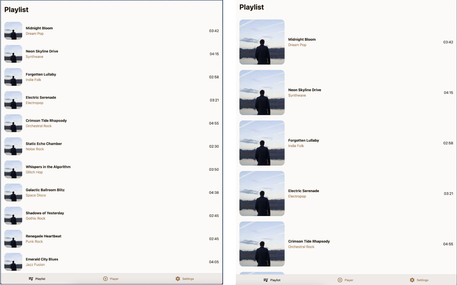
Let’s apply this to our SongTile component to make the album art larger on bigger screens.
// ... JSX remains the same
const style = StyleSheet.create(theme => ({    container: {        flexDirection: 'row',        gap: theme.gap(2),        alignItems: 'center'    },    image: {        width: 80,        height: 80,         width: {             xs: 80,             md: 120,             lg: 200         },         height: {             xs: 80,             md: 120,             lg: 200         },        borderRadius: theme.gap(2)    },    textContainer: {        flex: 1    }}))
With this change, the width and height of the image will automatically adjust based on the screen width. Unistyles handles the media query logic for you.
For more complex or specific conditions, breakpoint objects might not be enough. This is where the mq (media query) utility shines. It gives you granular control to apply styles based on precise width and height conditions.
Let’s modify our PlayerScreen to adopt a more traditional web layout on larger screens - a centered content:
 import { StyleSheet } from 'react-native-unistyles' import { mq, StyleSheet } from 'react-native-unistyles'
// ... JSX remains the same
const styles = StyleSheet.create((theme, rt) => ({    centerContainer: {        flex: 1,        justifyContent: 'center',        alignItems: 'center'      },      container: {        flex: 1,        gap: theme.gap(2),        alignItems: 'center',        justifyContent: {            [mq.only.width(600)]: 'center'        },        marginTop: rt.insets.top + theme.gap(3),      },      image: {        width: 200,        height: 200,        borderRadius: theme.gap(2)      }}));
Using the mq utility, you can target both width and height media queries. Importantly, these are automatically transformed into genuine CSS media queries, which offloads the computations from JavaScript for improved performance.
Web styling features
While Unistyles excels at universal styling, there are times you’ll want to leverage platform-specific features.
On the web, this often means using CSS pseudo-selectors like :hover and :active for a more native web experience and better performance.
Unistyles makes this incredibly simple with the _web property.
Let’s look at our SettingTile.tsx component. On native platforms, a common pattern to handle press states is to provide a function to your style definition, which receives the component’s state.
// ... JSX remains the same
const styles = StyleSheet.create({    container: (state: PressableStateCallbackType) => ({        flexDirection: 'row',        alignItems: 'center',        justifyContent: 'space-between',        opacity: state.pressed ? 0.75 : 1,    })})
This works perfectly on iOS and Android, but on the web, it relies on JavaScript to update the style. We can achieve a smoother and more performant result by using native CSS pseudo-selectors.
To do this, we’ll modify our container style and add a _web key. Inside this _web object, we can use special keys like _hover and _active that Unistyles will automatically convert to CSS pseudo-selectors.
const styles = StyleSheet.create({ container: { flexDirection: 'row', alignItems: 'center', justifyContent: 'space-between', opacity: state.pressed ? 0.75 : 1, _web: { _hover: { opacity: 0.75 }, _active: { opacity: 0.5 } } }})Styles inside the _web block will take precedence over the JavaScript-driven opacity logic, replacing it with _hover and _active selectors.
Now, when you hover over the tile on a web browser, the opacity change is handled entirely by CSS, providing instant feedback.
This is just the beginning! The _web property also allows you to add CSS animations and even target styles using custom class names.
What We’ve Built Together
Congratulations! You’ve built a complete, cross-platform music application that demonstrates the full power of Unistyles 3.0. Let’s recap what we’ve accomplished:
Core Features:
- Dynamic theming with light/dark mode support
- Adaptive themes that follow device settings
- Custom accent colors with persistent user preferences
- Cross-platform compatibility (iOS, Android, Web)
- Type-safe styling with complete TypeScript integration
Unistyles API
- Theme configuration with custom color palettes and utility functions
- Variants system for dynamic component styling
- Runtime integration for device-aware styling (safe areas, color scheme)
- Dynamic functions for complex style logic
- ScopedTheme for theme previews and isolated theming
- Reanimated integration with smooth accent color transitions
- Performance optimizations with selective re-rendering
- withUnistyles for unsupported props and 3rd party views
- useUnistyles for dynamic subscriptions
- Breakpoints and mq for responsive design
- Web only API for custom web components
Development Patterns:
- Merging styles managed by Unistyles and Reanimated
- Component composition with reusable, themed components
- State management with StanJS for clean, persistent user preferences
- Navigation integration with Expo Router and dynamic routes
Summary
You’ve just completed an incredible journey building a full-featured, cross-platform music application with Unistyles 3.0. From initial configuration to advanced theming and state management.
But most importantly, you’ve learned to think in Unistyles. You understand when to use variants vs dynamic functions, how to leverage the runtime for device-aware styling, and how to build components that are both flexible and maintainable.
This is just the beginning. With the foundation you’ve built, you can now tackle any styling challenge React Native throws your way. Whether it’s complex animations, responsive layouts, or intricate theming systems - you have the tools and knowledge to build beautiful, performant apps that work everywhere.
Ready for your next project? Take these patterns and run with them. Build the app you’ve always wanted to create, knowing that Unistyles has your back every step of the way.
Welcome to the future of React Native styling.